Prinsotel
Prinsotel is a hotel group with a long tradition, operating four hotels in Mallorca and two in Menorca, all of which follow the classic sun and beach model. Before the pandemic, their services were contracted almost exclusively through tour operators. However, in 2021, the company decided to take a new direction by significantly reducing bookings through tour operators and increasing direct bookings. This strategy has driven Prinsotel to embark on a multi-level transformation process, aiming to offer a unique, authentic, and higher-quality experience that sets them apart from the standardized experiences typically offered by large hotel chains.
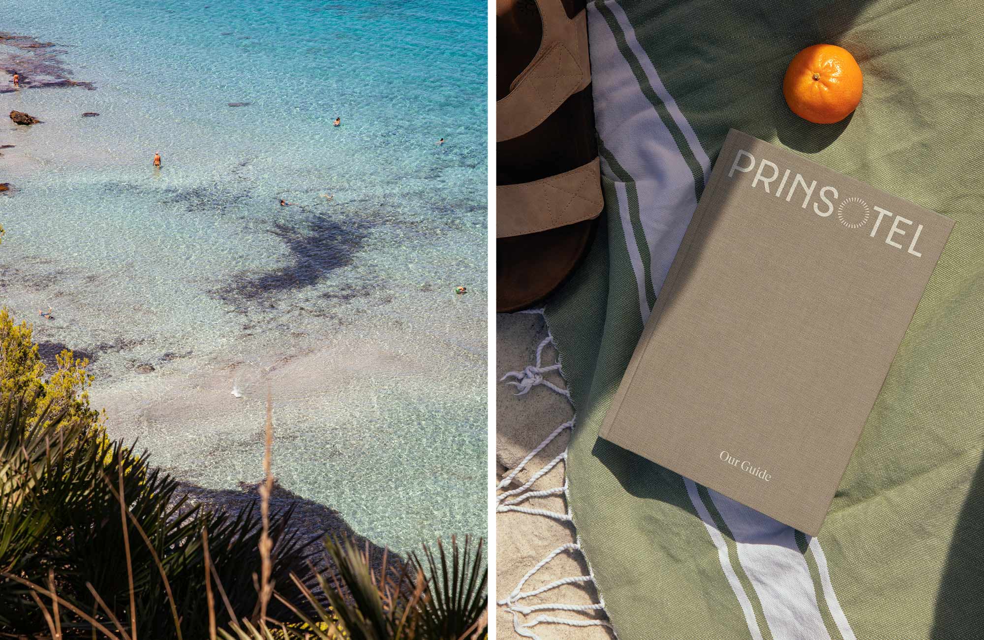
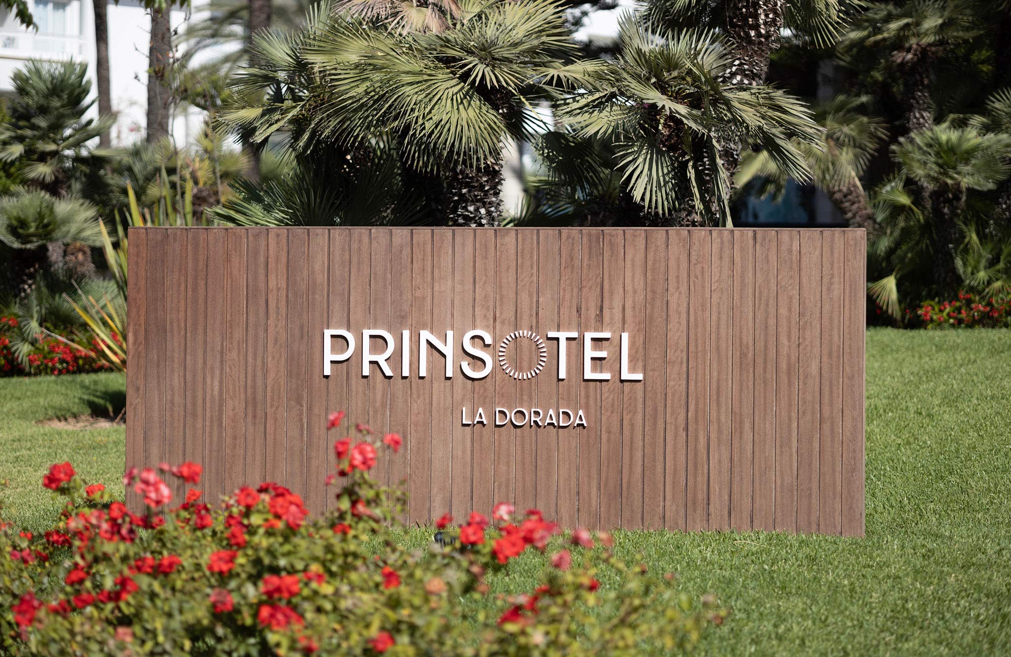
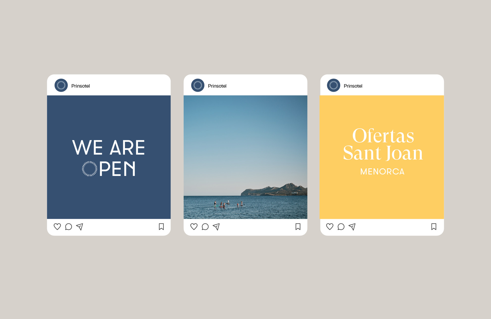
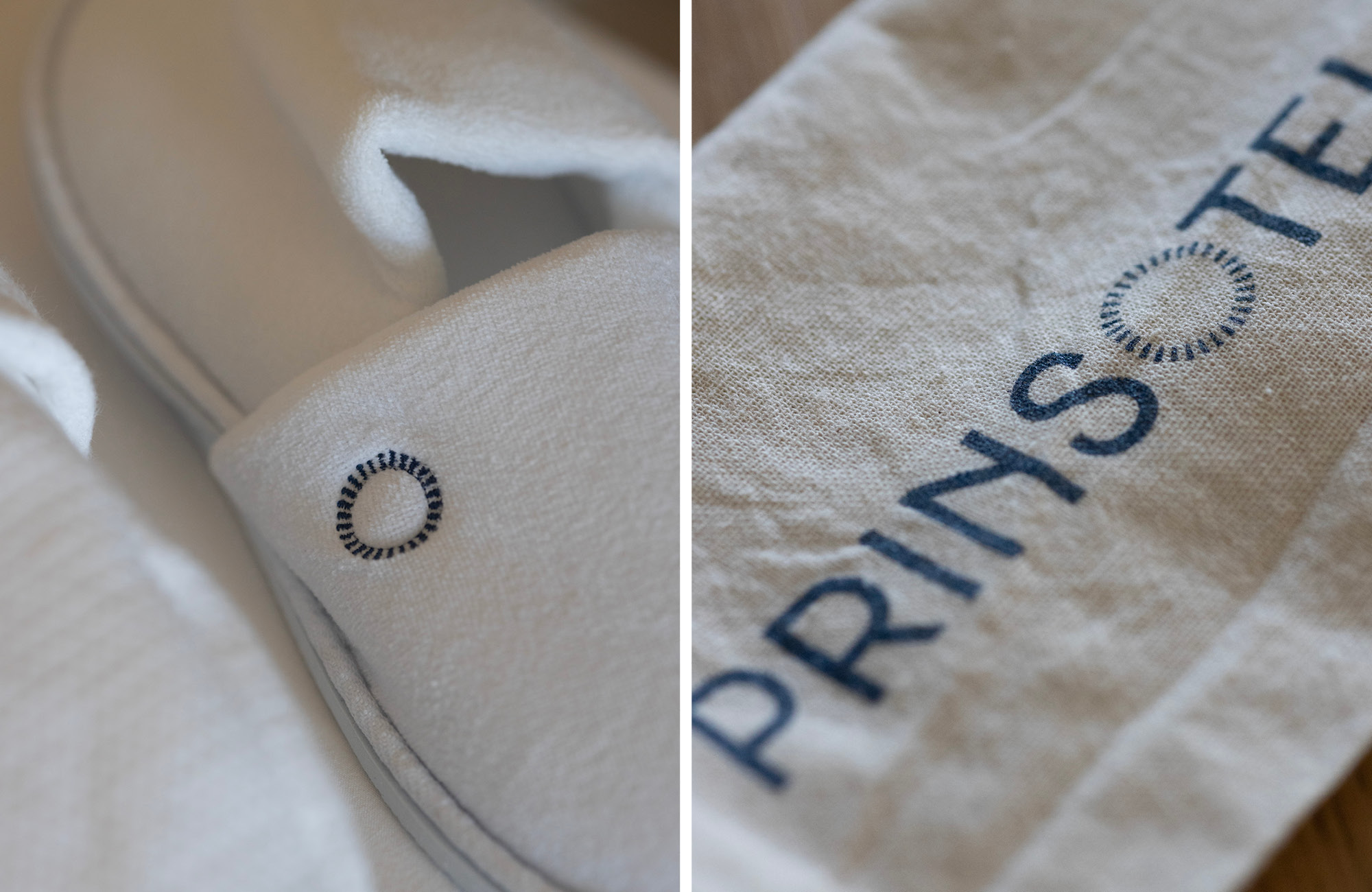
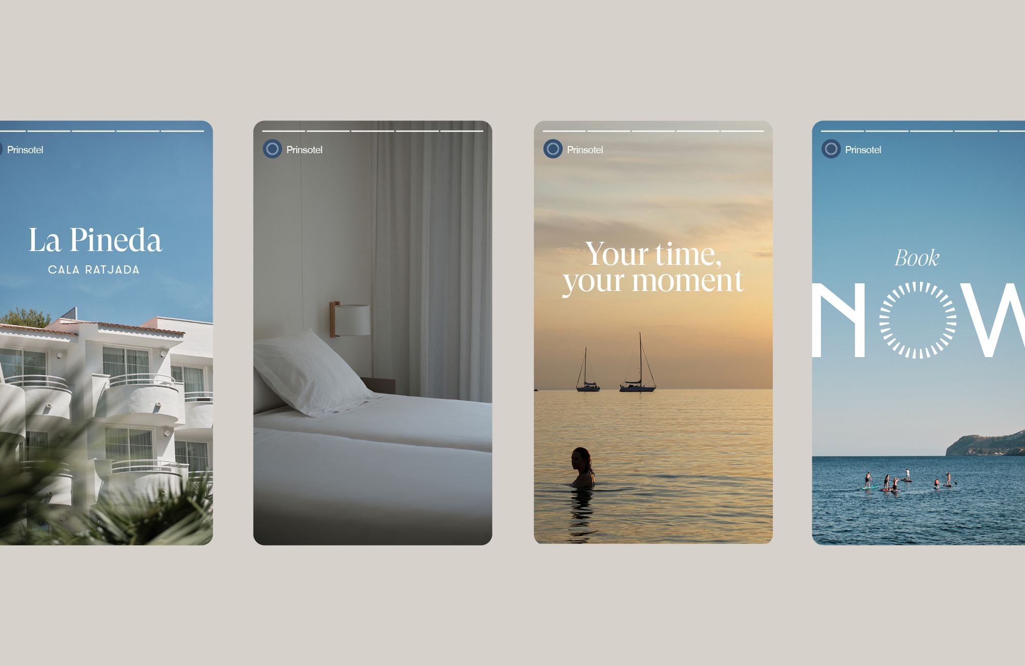
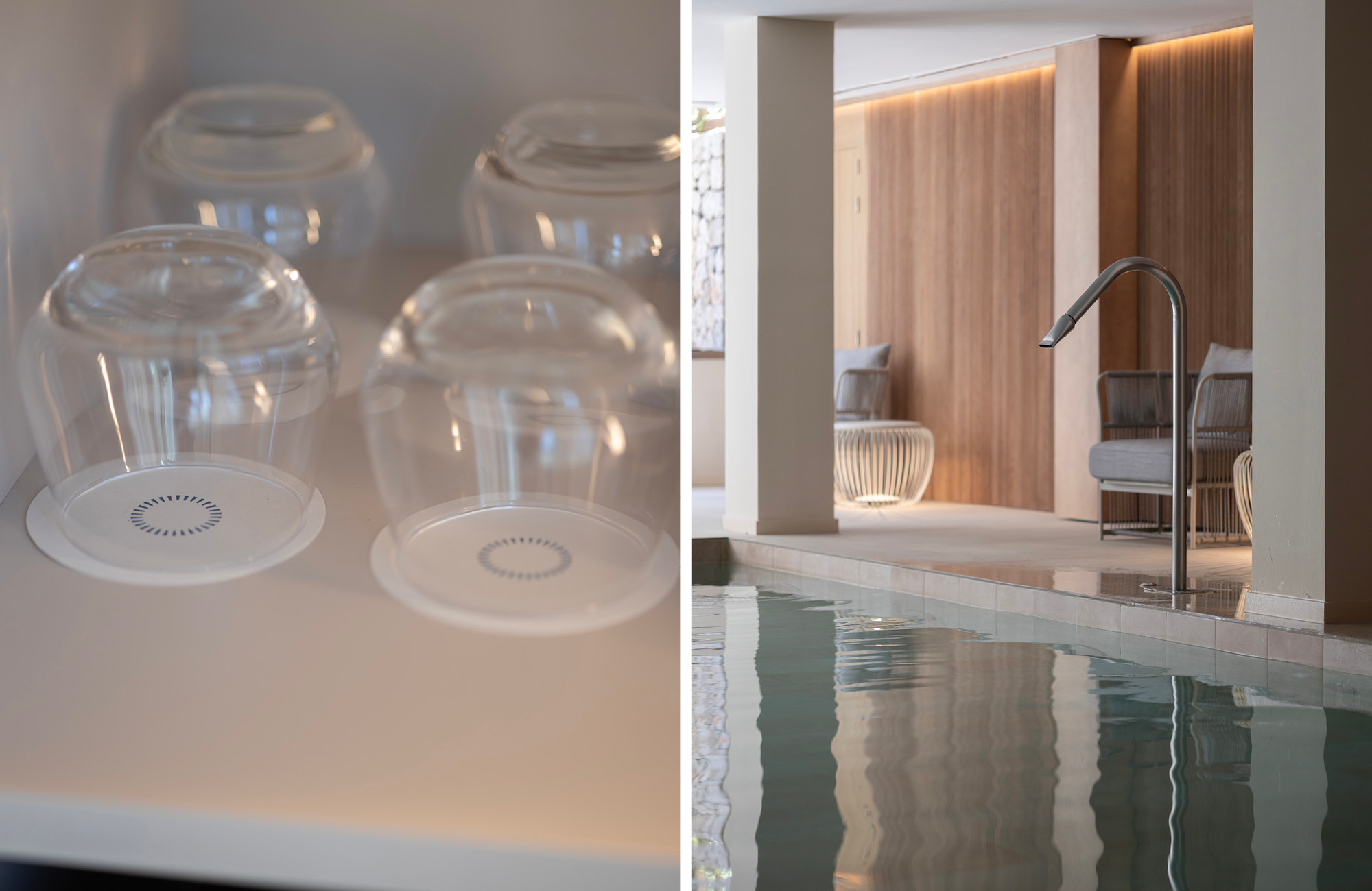
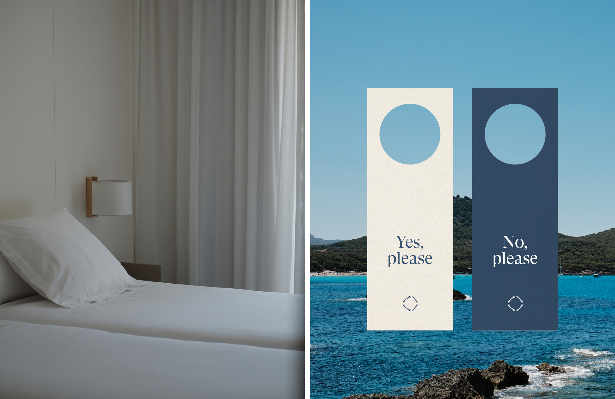
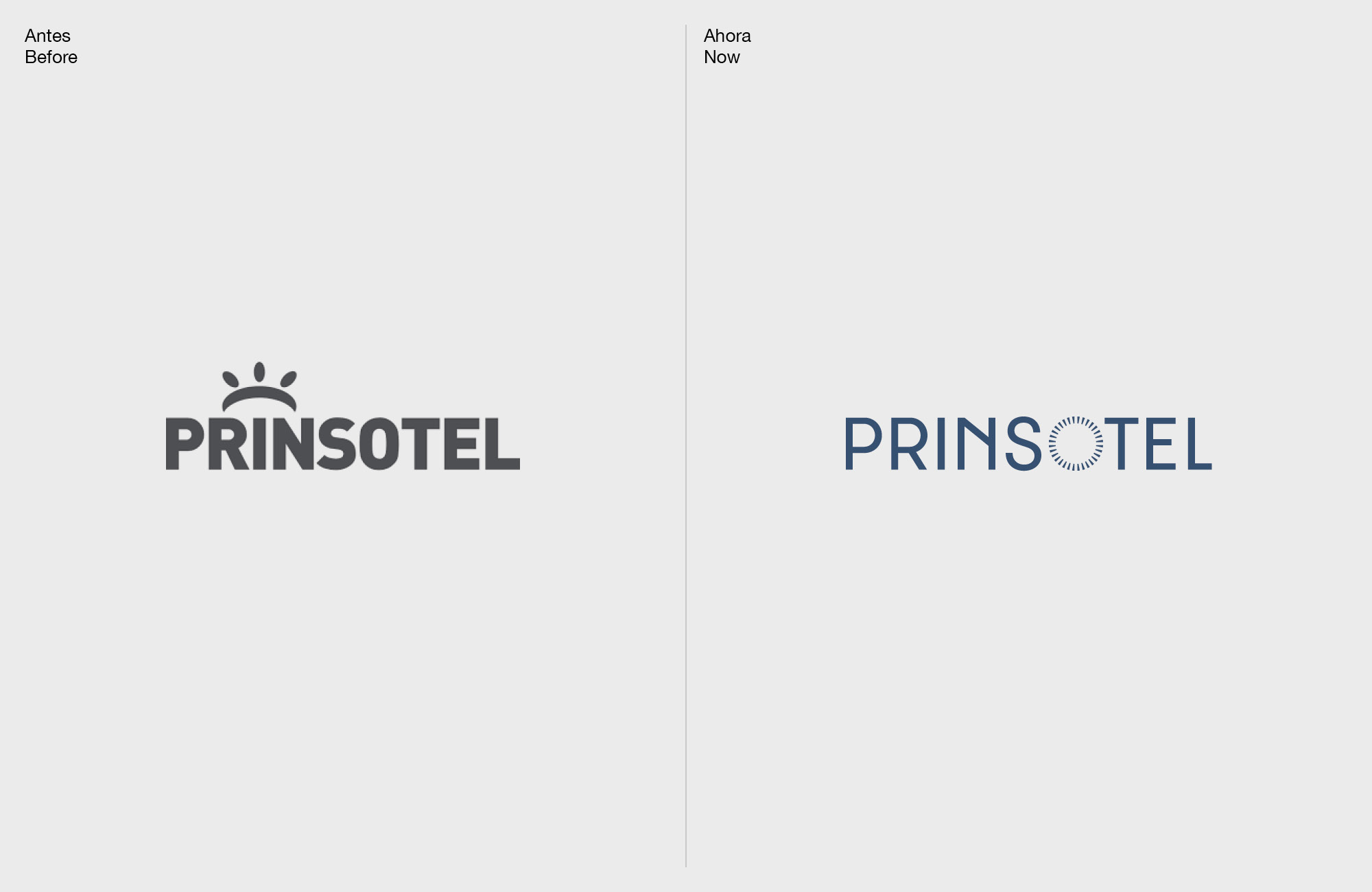
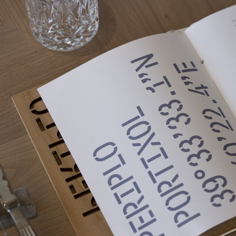
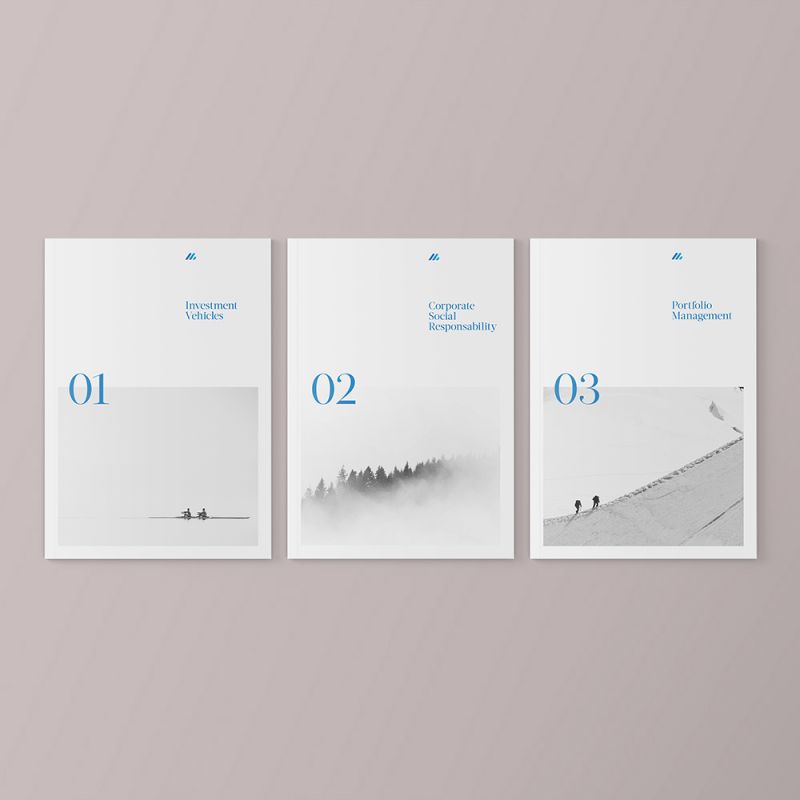
The rebranding project aims to revitalize the brand and align its identity with the group’s values, new positioning, and strategy. As a graphic solution, we propose a new symbol based on a reinterpretation of the previous one, suggesting concepts such as light, energy, community, and group. This symbol is integrated into the corporate typography to create a visual language that provides differentiation and recognition within the sector.
We expanded the color palette with fresh and vibrant colors, adding greater graphic richness to the visual identity system. Finally, we strengthened the typographic system with a secondary typeface that contrasts with the primary one, providing an additional, more expressive, and humanistic voice.