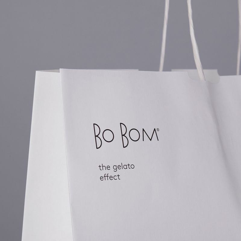
Bo Bom
Strategy, Naming, Visual Identity and Graphic Communication for Bo Bom, the gelato effect.
Bo Bom is a new Gelateria in Palma de Mallorca that wants to recover and value the exceptionality of the authentic artisan Gelato that in recent years has been discredited by many businesses that sell it as an industrialized product. It also wants to be a space to provide pleasure through the senses offering a variety of frozen products.
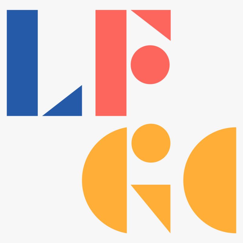
The naming comes from the concept of flavor explosion. It is an onomatopoeic name that evokes something good, sweet, intense and explosive. The idea of onomatopoeia seemed interesting because it suggests something spontaneous, natural, authentic.
We have designed the characters that make up the logotype based on basic geometric figures in order to create a unique brand. The geometry and basic construction of these characters expresses the simplicity and freshness of the brand. It refers to the authentic artisan product that has had minimal processing, away from the elaborate industrial processes.